How Much Bioinformatics Do Vision-Enhanced Large Language Models Understand?

After a surprising observation of our experts exploring the possible applications of multimodal AI systems to data analysis, we posed ourselves the following question: Can vision-enhanced large language models understand figures of plots and charts typically used in bioinformatics, process their information and summarize it or answer questions about it?
Although this is in itself a question that could take a whole research project to be properly addressed, we wanted to have a rough approximation to the issue. We then carried out some tests on how much OpenAI’s vision-enhanced models understand about plots commonly used in bioinformatics, about biomolecular structures, and about other biology-related material presented in picture format. We found that they can indeed understand quite a bit. In fact, it looks like with proper prompting and probably some pre- and post-processing, these and future AI models could become of great help in automatizing data analysis, assisting users to interpret results, and more. AI keeps amazing us and revolutionizing work in scientific research and development!
Let us show you here the most interesting results obtained in our tests with GPT-4o in ChatGPT. We have grouped the tests in two main topics representative of analyses requested by our clients: on RNA-seq data, and on protein structure model analysis.
Example 1: Vision Models Acting on Plots From RNA-seq Data Analysis
1.1 Interpreting volcano plots
One of the most common tasks in bioinformatics is interpreting differential gene expression data, often visualized using volcano plots. We tested GPT-4o’s ability to analyze such plots by providing it with the following image taken from this free online tutorial:

This was GPT-4o’s answer:
This volcano plot represents differentially expressed genes in Arabidopsis thaliana infected with Pseudomonas syringae DC3000 compared to a mock treatment. Here’s my interpretation:
1. X-axis (Log₂ fold change):
Positive values indicate up-regulated genes (higher expression in infected samples).
Negative values indicate down-regulated genes (lower expression in infected samples).
2. Y-axis (-Log₁₀ P-value):
Higher values indicate stronger statistical significance.
3. Color coding:
Gray: Not significant.
Blue: Significant by p-value but not by fold change.
Red: Significant by both p-value and fold change threshold.
Key findings:
Up-regulated genes (right side, red dots):
Strongly induced genes include AT5G42800, AT1G52440, AT1G73325, AT4G18440, among others.
These genes are highly expressed in infected plants.
Down-regulated genes (left side, red dots):
Examples include AT4G28940, AT5G04100, AT1G04220, AT1G02440.
These genes are significantly suppressed during infection.
Biological Implications:
Up-regulated genes may be involved in plant immune responses, such as defense signaling, stress response, or antimicrobial activity.
Down-regulated genes might be involved in normal cellular functions that get suppressed during infection.
You can see how the first part of the response clearly reads our the main features of the plot, explaining what the axes and label colors are, and even considering the plot’s title. Then, the model distills lists of genes that are up- or down-regulated passing the thresholds with strong statistical significance. Note that the list is correct for the up-regulated genes but has a few problems with the down-regulated ones. On inspection of the plot it becomes clear that this is due to the labels not being clearly resolved, even for humans.
One gear up, somehow the model knows correct information about the identified genes, so it can draw some simple conclusions about the biological significance of the results.
Truly amazing, if it were not just for that small problem on reading the labels, which in a real scenario could probably be improved.
1.2: Analyzing p-value distributions for statistical validity
To test the model’s understanding of statistical distributions, we uploaded a histogram displaying RNA-seq p-values from two sets of differential expression analyses, in this case edited from this tutorial:
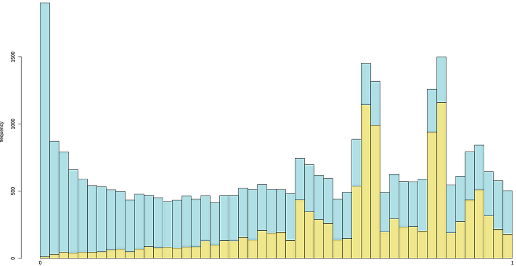
And this was its answer, perfect in all senses:
This histogram represents two distributions of p-values from RNA-seq data, likely comparing two different sets of statistical tests. Here’s my assessment:
* What looks normal?
Uniform distribution of non-significant p-values:
The light blue bars seem to follow a relatively uniform distribution across the range, which is expected under the null hypothesis (genes with no real differential expression should have p-values uniformly distributed between 0 and 1).
Enrichment of low p-values:
The peak near p = 0 suggests that a subset of genes show strong statistical significance, which is expected when there are truly differentially expressed genes.
* What looks weird?
Excessive spike at p = 0:
If there is an unnaturally large spike at exactly 0, this could indicate a bias or an issue in the statistical testing (e.g., overfitting, batch effects, or miscalculated p-values).
Bimodal distribution:
The yellow distribution appears to have multiple peaks, which is unusual. Normally, p-value distributions should either be uniform (under the null hypothesis) or show a single peak at low p-values (for differentially expressed genes).
Peaks at intermediate p-values might suggest issues with normalization, batch effects, or improper multiple-testing corrections.
* Potential issues to check
Overdispersion or poor model fit: Are the statistical methods used properly accounting for biological variability?
Multiple testing correction issues: If false discovery rate (FDR) correction wasn’t applied correctly, the distribution could be skewed.
Batch effects or confounding variables: If the data contains hidden covariates, it can introduce unexpected structure in the p-value distribution.
Example 2: Vision Models Acting on Screenshots of Molecular Structures
3.1 Understanding structural models of the AlphaFold-EBI database
The AlphaFold 2 and 3 systems revolutionized modeling but of course they aren’t infallible. To help users understand what’s likely correct and wrong in a structural model, AlphaFold returns not just the atomic coordinates that constitute the structural model but also quality metrics, of which the most important ones are the residue-wise pLDDTs and the inter-residue PAEs. We here tested GPT-4o with vision capabilities on this Uniprot entry precomputed at the AF-EBI database:

And this was the LLM answer:
From your screenshot, we can analyze the quality of the model based on the pLDDT confidence scores and the Predicted Aligned Error (PAE) plot:
Model Confidence (pLDDT)
The Mol* 3D viewer colors the model based on confidence scores.
Most of the structure is colored in blue (high to very high confidence, pLDDT > 70–90), suggesting that the individual domains are well-predicted.
However, some loops and termini (orange/red, pLDDT < 50–70) have lower confidence, which is expected for flexible regions.
PAE Plot Analysis (Domain Orientation)
The PAE plot (right panel) indicates how well the relative positions of different residues are predicted.
A low PAE (dark green) means the relative position between two residues is well-defined.
A high PAE (lighter green/white areas) suggests uncertainty in the relative positioning.
Interpreting the PAE
The diagonal (self-alignment) is always well-defined.
The block-like structure in the PAE plot suggests two or more well-defined domains with high internal confidence.
However, lighter green areas between the blocks indicate uncertainty in the relative orientation of these domains.
If your interest is in the relative orientation of the domains, this suggests the model may not be reliable in that aspect — it might have multiple plausible conformations.
Conclusion
The individual domains are well-modeled, but their relative orientation might be uncertain.
If functionally relevant, you might consider experimental validation (e.g., cryo-EM, SAXS, or NMR) or molecular dynamics simulations to explore domain flexibility.
If you need a more rigid structure, you could look for homologous experimental structures or use AlphaFold-Multimer if interactions between chains matter.
The answer was pretty neat and correct. However, we realized that we might have confused the model by talking about two domains, when the screenshot actually shows three. We then asked a follow-up question:
Now checking carefully I see the TED Domains thing shows 3 domains… am I right that according to the PAE plot the arrangement of the first two domains is confident, but not so much their arrangement relative to the third one?
The answer, based on an inspection of the PAE plot considering now that there are indeed 3 domains, the first two being confidently modeled relative to each other and the third one only modeled confidently locally, is again perfect:
Yes, your interpretation is correct! The TED Domains annotation indicates that the model has three domains, as shown by the color-coded segments at the top of the PAE plot.
Looking at the PAE plot:
The first two domains (green and orange segments) have low PAE values between them (darker green in the top-left block of the matrix). This suggests that their relative orientation is well-defined and confident.
However, the third domain (purple segment) shows higher PAE values relative to the first two (lighter green/white regions in the lower-right part of the matrix). This means that the relative position of the third domain is uncertain — it may adopt multiple conformations.
What This Means for Your Analysis
The first two domains likely form a rigid unit with a stable interaction.
The third domain may be more flexible relative to the first two, possibly moving independently or being less constrained in solution.
If this flexibility is functionally important (e.g., for ligand binding, protein-protein interactions, or conformational switching), experimental validation like SAXS, cryo-EM, or FRET could be useful.
3.2 Visual analysis of protein-ligand complexes
We next geared up to ask GPT-4o with vision a more complex problem. Given a 2D snapshot from a molecular graphics program showing a ligand bound to a protein, can it infer what kinds of contacts the two molecules establish?

The question was:
Here’s a screenshot of ibuprofen docked inside a pocket in BSA. What interactions do you see between the ligand and the protein? I want you to tell me exactly what interactions you see in this structure from the screenshot provided.
And this was the answer:
From the screenshot you provided, I can visually infer potential interactions, but without residue labels or a precise atomic distance measurement, I can only make educated observations. Here’s what I specifically see in your image:
1. Hydrophobic Interactions:
Ibuprofen (highlighted in yellow) is embedded in a hydrophobic pocket of the protein.
It appears to be surrounded by gray carbon atoms from amino acid side chains, likely hydrophobic residues (e.g., leucine, valine, phenylalanine, or isoleucine).
The benzene ring of ibuprofen seems to be in close contact with other aromatic or aliphatic side chains, suggesting π-π stacking or van der Waals interactions.
2. Hydrogen Bonds:
The carboxyl (-COOH) group of ibuprofen appears to be interacting with nearby blue (nitrogen) or red (oxygen) atoms from the protein.
There is at least one close contact between the oxygen of the carboxyl group and a protein residue, likely forming a hydrogen bond with a backbone amide or side chain hydroxyl (e.g., Ser, Thr, Tyr, Asp, or Glu).
3. Possible Electrostatic Interactions:
Ibuprofen is negatively charged at physiological pH (carboxylate anion, -COO⁻).
There may be a salt bridge or ion-dipole interaction if a positively charged residue (e.g., Arg, Lys, or His) is nearby, but I cannot confirm the exact residue from the image alone.
What I Cannot Determine from the Screenshot Alone:
Precise interacting residues: No residue labels are visible.
Exact interaction distances: Hydrogen bonds and electrostatic interactions typically require precise atomic distances (~2–3 Å).
Interaction strengths: Molecular modeling software would be needed to confirm interaction energies.
The answer was quite good, especially considering that the picture is just a static 2D view and is quite crowded in atoms. In fact, it correctly pinpoints that the ibuprofen is shown in yellow, and highlights hydrophobic and aromatic contacts around its aromatic ring, both of which do happen (#1 in the figure below), and hydrogen bonds from its carboxylate group to nearby N and O atoms (#2 in the figure), adding that there might also possibly exist a salt bridge between that same carboxylate and some positively charged group of the protein that it can’t distinguish clearly (#3).
For your reference, we show these interactions in the next figure, numbered 1, 2 and 3 as they were mentioned:

Conclusions and Nexco’s Outlook on AI in Bioinformatics
Our exploration of vision-enhanced large language models in bioinformatics analysis has demonstrated remarkable potential: GPT-4o could interpret plots related to RNA-seq data analysis, statistical distributions, outputs from AlphaFold 3 predictions, and molecular structures. While some challenges remain — such as label resolution in dense plots or lack of 3D perspective in molecular structure analysis — the model’s ability to extract meaningful biological insights, assess statistical validity, and even infer molecular interactions from static images is more than impressive. With proper prompting and continued advancements in AI, these models could become invaluable tools for accelerating data interpretation and decision-making in bioinformatics, reducing the load of human experts who can dedicate their time to more complex problems while the software assists non-experts to interpret simpler graphical outputs.
At Nexco, we are at the forefront of exploring how AI can revolutionize scientific research. By rigorously testing cutting-edge models and identifying their strengths and limitations, we are pushing the boundaries of automated data analysis. As these technologies evolve, we remain committed to leading the way in integrating AI-driven solutions into bioinformatics, ensuring that researchers and industry professionals can harness the full power of AI for discovery and innovation.
To know more about Nexco, check our Services pages including our AI Solutions, and don’t miss on ONex, our streamlined web app that makes Omics data analysis seamless.
Related Posts

Our location
Nexco Analytics Bâtiment Alanine Route de la Corniche 5B 1066 Epalinges, Switzerland
Give us a call
+41 76 509 73 73
Leave us a message
contact@nexco.chDo not hesitate to contact us
We will answer you shortly with the optimal solution to answer your needs
© 2024 Nexco Analytics. All Rights Reserved.